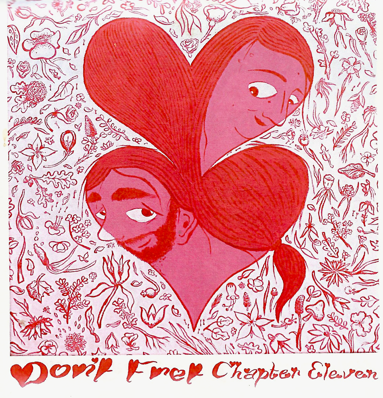
 Don’t Fret: Chapter 11
Comic zine, Jordan Reg. Aelick, 64pgs, fretfretfret.com, $4
Like many cartoonists as of late, Jordan Reg. Aelick has taken to the Instagram ready daily panel format, using the platform to serialize a narrative through a daily comic. There are, of course, ten chapters previous to this edition. Having begun here, I can’t necessarily speak to the long game plot of Don’t Fret. I can, however, speak to the art, which I think is fantastic.
Aelick’s lines are thick, and each character is highly stylized. Faces are expressive and bold, allowing no doubt how each character is feeling. The backdrop of characteristic buildings and locales in Toronto, while just as stylized, convey an eye for details, with the sheer quantity of lines being used demonstrates the high degree of care. Aelick’s artwork reminds me of a number of people, but it is also developed enough that those possible influences aren’t so visible as to be distracting. Every actor on the page is distinct and lovingly crafted. The panels are often busy, but given the daily serializing, one might expect each panel to be fleshed out. My only gripe with this is the clamshell orientation. It opens vertically, with a horizontal fold. This is novel, but results in a sort of book design fusion of Brian Chippendale’s If ‘n’ Oof, and Dash Shaw’s Bodyworld. I’ve got nothing against single panel formats, but at this size, it’s a little awkward to read.
All told, I very much enjoyed Don’t Fret: Chapter 11. I’m looking forward to reading the rest, and catching up on Aelick’s current serialization.