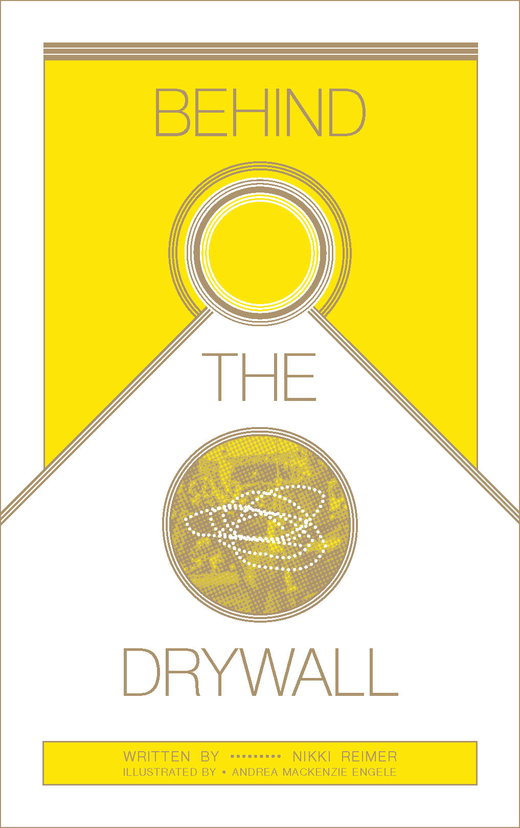
Behind the Drywall
By Nikki Reimer & Andrea Mackenzie Engele, 20pgs, Gytha Press, gythapress.org
A striking, symmetrical Art Deco-inspired geometry peers out from this zine’s cover. Underneath the methodical, almost Futurist composition is something more human, however. An image fragment shows a woman on a horse, perhaps a vintage shot from the Calgary stampede. They are obscured by a knot of a dotted line, though, a cranky design that could easily represent dance instructions for pacing in circles or some particularly sloppy telegraphy. Inside, these same motifs whisper the unusual and quiet Exodus story of Calgary, Alberta and the people left in its wake.
Once a booming frontier city awash with oil money and young greed, Calgary’s skyline shot up rapidly, its towers signaling neverending opportunity, wealth and action. But the past few years have seen Calgary’s young people vanish and swathes of its middle class drift from the city. COVID policies left soaring office buildings nearly empty. The details of what’s behind this shift mostly go unexplained, but this zine is more a ballad of loss and location than it is a docket of hard data. Behind the Drywall laments the overeager development of a city addicted to extraction and exploitation, short-sighted in its vision, but lifts up the people who are left in its wake. Indeed, Nikki Reimer’s writing does not smack of any performative shame about the city’s shortcomings per se. She is instead wistful, examining the melancholy of a place where the wrong promises were made, always already impossible to keep.
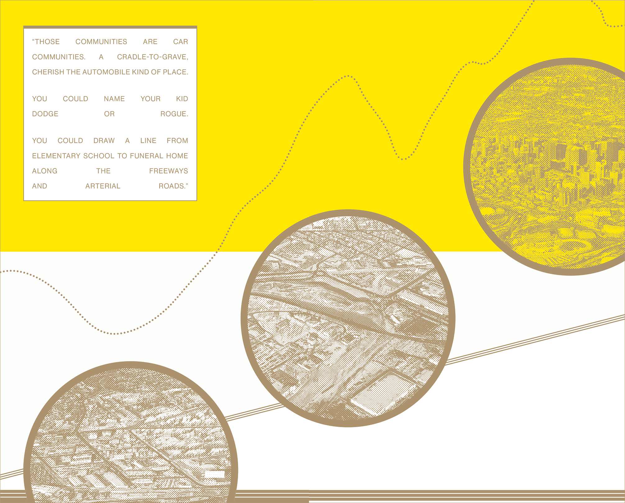
The high-minded design seen on the cover continues throughout the zine. Andrea Mackenzie Engele offers a few neat archival photos throughout, but her experimental typography takes the lead. Some of these choices are too heavy handed or difficult to read, but only some. In all, her layout captures the dreamy, existential thrust of the text, and any clunky bits are saved by an excellent print job. A stunning, rare gold ink demands the reader’s attention, complete with the telltale textures of Risograph printing. Although published and distributed by hometown heroes Gytha Press, this publication also announces the impressive arrival of Yolkless Press, a new Calgary outfit responsible for its ink-to-page production. Yolkless achieves a high standard with its execution, worth noting given the presently saturated market for Riso.
All of these elements — the politics, the prose, the page, the printing — converge in a moment of bliss at the zine’s end. “To walk through// miles of nothing,” read Reimer’s final words, split across the final spread. Beneath it, a thin trail of dots wanders through, dividing a sea of apparent emptiness, a blank rectangle that might have been filled with a flat, crude-oil black in lesser hands. Here, though, “nothing” mustn’t mean nothing, and we are treated to a muddy, magnetic, rich expanse of gold, gold, and more gold. Bravo.