

Cabaret
Chapbook, Derek Beaulieu, 14 pgs, above/ground press, abovegroundpress.blogspot.com, $4
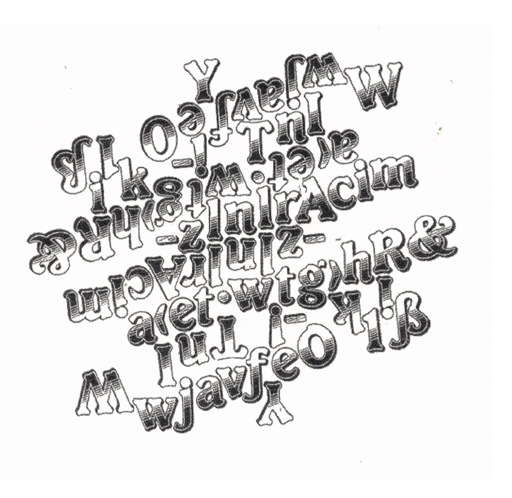
It doesn’t take long to grasp the technicality of what this is — in Derek Beaulieu’s words, “symmetrical visual poetry, all using the same typeface.” The stumper is why it’s so hard to turn away from it. Perhaps bewilderment breeds amusement.
Beaulieu’s latest collection of concrete poems begin from central, seemingly random letters or punctuation marks, with like letters radiating out in two directions. It creates something that’s not quite a mirrored image or an inkblot, but the opposite sort of reflection, if there’s a name for that.
After a short time communing with these images, you’ll likely give up trying to decipher what, if anything, the selection or arrangement of letters means. Your focus will turn instead to the method behind the symmetry, as you maddeningly turning the page around and around to see what it looks like from every direction. Satisfied that a symmetry of sorts does exist, you’ll move on to the shape and the typeface, Does it suggest anything? The text is certainly carnivalesque and whimsical, a marquee font if there is one — deserving of the title Cabaret. The smaller designs could be headlines from a performance poster.
In the end, this appears to be more a feast for the eyes than a puzzle to decode. It demands your engagement, which on its own is a desirable achievement.