Sign of the Times New Roman
Amy Lam looks at the changing face of type and the indie type foundries who have to battle the big, bold Helveticas of the world
By Amy Lam
I have terribly inconsistent handwriting. I don’t think I ever learned to hold a pencil properly: I tuck my thumb into my fist and my pinkie smudges all over the place. A quick flip through my notebook reveals that some days I’m noodling lazy, and other days I’m all-business caps. Sometimes going back to my notes is like an archeological expedition; Amy From The Future trying to figure out how Amy Of The Past survived on some migratory hunter-gatherer’s diet. Who was I, and how did I live, when I dotted my “i”s with pot leaves?
To you, though, I’m deceivingly stable. From now until the end of this article, I will be the balanced strokes of the Roti typeface, never trailing off into the margins with my wobbles. Type, as Robert Bringhurst in The Elements of Typographic Style points out, is “idealized writing,” a supremely confident, unfailing super-human hand. And nowadays, with digital design and printing processes, type has many faces. A typeface (commonly, but somewhat inaccurately, referred to as a font) is a consistent representation of the alphabet, created by a type designer with a specific vision while working with in specific constraints. So type design sits at the intersection of many different fields, possessing a lineage that incorporates, with commercial intent, the expressive force of a teenager writing messy to piss off her teacher and the material limitations of changing technology. Type itself is a site where you can find not only the style, but also the substance, of the times.
In Indie Fonts Vol. 3: A Compendium of Type from Independent Foundries, we can ostensibly find a document of how we are feeling. Indie Fonts 3 is a type specimen book that compiles over 1,900 typefaces from 20 independent type foundries. In the past, a printing press company such as Linotype distributed type specimen books to demonstrate and sell new typefaces to printers. Designed by a compositor–a person in a print shop who, given copy, would physically assemble the metal type for the page–a type specimen book showcased typefaces in all sorts of contexts, showing you exactly how you could use Caslon in an ice cream ad, as well as in an eviction notice! Nick Shinn, a Toronto-based type designer featured in the book, describes it as something that escapes the inherently ephemeral nature of digital type, promotion of which generally lacks physical staying power.
As Shinn describes, for independent type foundries, a book like this is especially important. A few, very large, corporations dominate type design. There is the Monotype Imaging, Inc. type foundry, which owns the rights to and produces the typefaces you are probably most familiar with, like Times New Roman and Helvetica (the latter through its acquisition of the other big legacy type foundry, Linotype). Then there are the big software companies like Microsoft, Adobe, and Apple, who create typefaces to bundle with their products: they are not genuine type foundries, as type design is but a sideline to their main business of selling software. And finally, there are the independent type foundries, like the one Shinn operates.
Hundreds of independent type foundries exist around the world, and they are generally micro-operations, run by as few as one person to as many as a dozen. Their sole business is type. Myfonts.com is the largest online marketplace for typefaces created by these foundries; on the website, you can find anything from a hairy typeface to a typeface that mimics your great-aunt’s handwriting. As an example of the wide variety of work that indie type foundries do, Shinn designed a custom typeface for the Globe and Mail (Walburn), as well as one for experimental poet Christian Bök (Panoptica). Some of these foundries do work that plays with the very definition of type: Jonathan Barnbrook, of Virus Fonts, has made a typeface named Burroughs (after William S.) that, upon printing, retains the document’s layout but substitutes all the text that has been set in it with randomly generated text.
So while there has been a lot of hype generated about the Helvetica typeface lately, what with the release of the documentary of the same name, Shinn puts it best when he says that while we may associate its clean functionality with a modern sensibility, it is actually thoroughly uncontemporary. At 50 years old, its designer is no longer living, and profits made from licensing and selling it accumulates in the coffers of the 120 year-old Monotype corporation. (The Monotype machine was the first fully mechanical typesetter.) And while the sans-serif typeface now denotes modern functionality, in the 18th century it evoked antiquity, a primitive time when the precise tools needed for the decorative nature of a serif simply weren’t available.
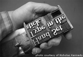
Furthermore, like many other legacy typefaces, Helvetica wasn’t necessarily designed to be used with today’s technology, while some of the new typefaces that are being produced are more attuned to the pixel nature of the screen. Nicholas Kennedy, proprietor and head compositor of Trip Print Press, a Toronto-based print shop that uses exclusively the letterpress process, describes how typefaces were designed and made to work with specific analog printing technologies, with special features that would make more efficient use of ink and so on. Working with metal type, setting each letter by hand, Kennedy extols the virtues of learned typography, considering and respecting the constraints of your medium. So while the choice offered by type foundries large and small may seem alternately overwhelming and paralyzing, it can allow for some smart design that communicates your best, most present, self. I am this sane yet stimulating serif, can’t you see?

