
 True Youth Bootlegs
Zine, Dicey Studios, 64 pgs, Otomatik Muziek, otomatikmuziek.bandcamp.com, €4
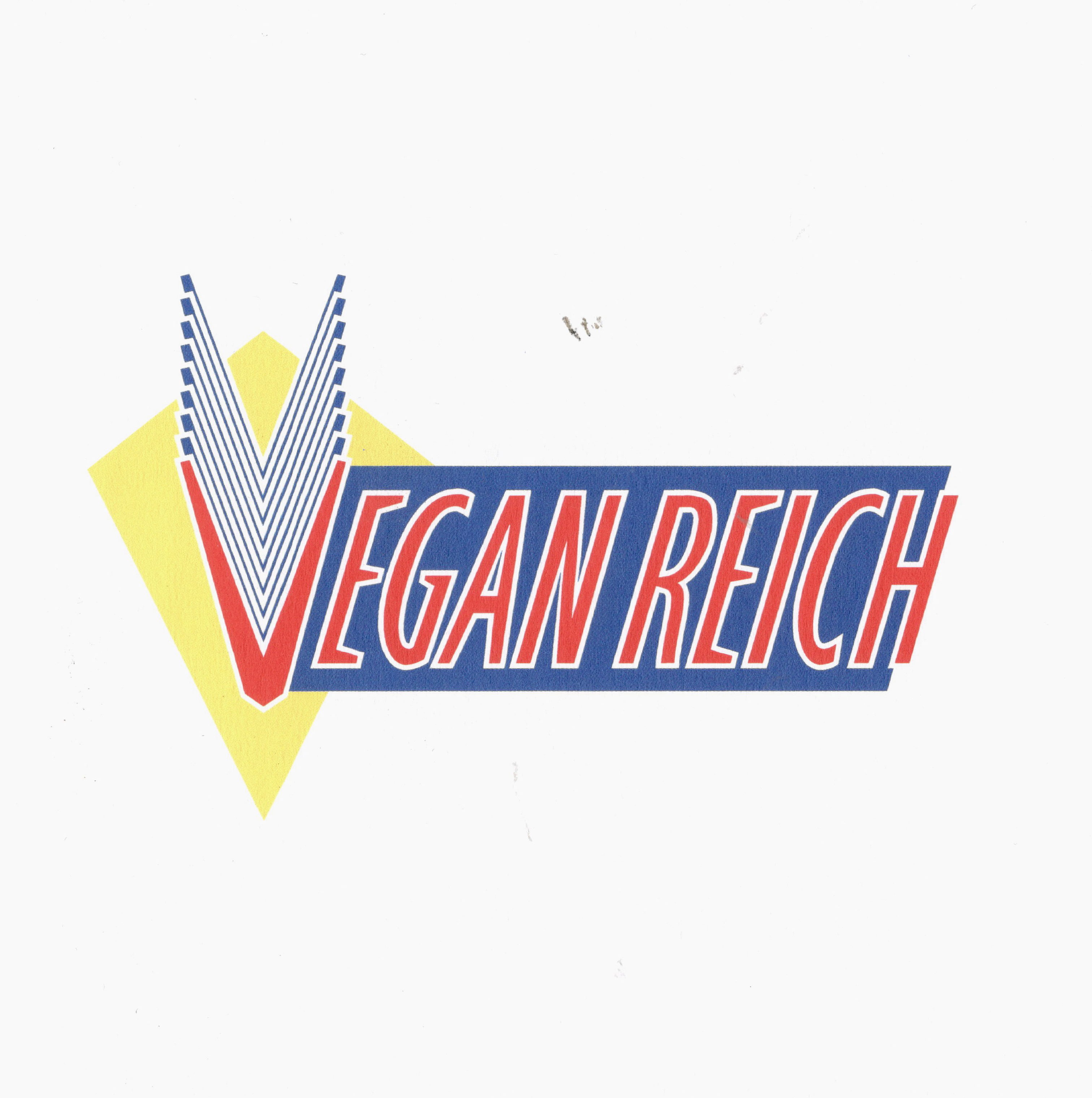
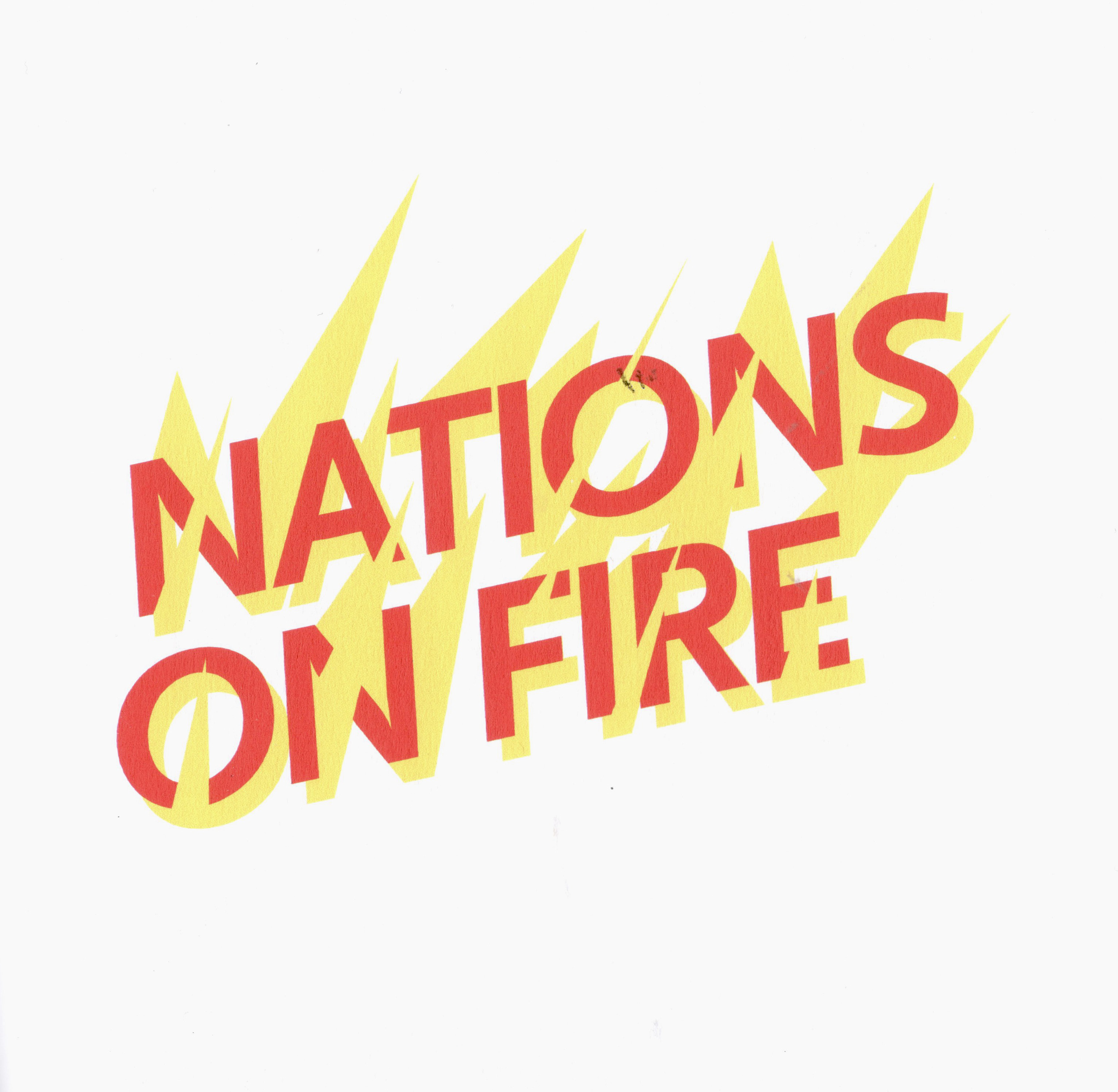
Ironic metal shirts, where a pop star’s name is styled like a death metal logo, are now so common that they are sometimes official merch. True Youth Bootlegs takes this trope and reverses it. Hardcore band names of the ’80s and ’90s are redesigned as flat, minimal typographic logos in a brittle colour palette of red, blue, and yellow. Shorn of their original aesthetics, the words shift in meaning, becoming ambiguous signifiers. When typeset in bright geometric lettering, “Raw Power” could easily be a washing powder logo, and not an Italian hardcore punk band.
The description for the zine, “Re-examining an emblematic youth subculture in word and image,” is printed on its back cover, but the intent behind this re-examination is unclear. The zine itself is part of a twin edition: the counterpart to the paper zine is a wearable textile version. No, it’s not a t-shirt, an obvious choice for reworked band logos. It is instead a light, viscose scarf.
Unlike a Carly Rae Jepsen heavy metal T-shirt, the logos here are not ironic — instead they are decontextualized. Speaking an aesthetic language of “experimental graphic design,” they are free from any particular real-world semiotic meaning.
Though still decisively masculine, much like hardcore itself, any subversive element is gone, and the words themselves — “The Faith,” “Unity,” “Youth of Today”— easily blend into the hegemonic structures theses bands were trying to escape from.
Though the overall meaning remains ambiguous, the project is otherwise a handsome love letter to, and critique of, the culture of hardcore and its lasting impact.